How To: Build Client Health Trend Line
November 20, 2017 1 Comment
I’ve received great feedback on my previous post, Client Health – More than Just Percentages, as well as several requests for the SSRS .RDL file. Instead of sharing the file, I’m going to talk you through the process to create it yourself! First, let me say with that previous post, those are examples, and you probably wouldn’t show them all on the same page. I’ll break these down into a couple posts.
This example is to create the trend line report to get a better understanding of client health over time (both percentage, and client count).
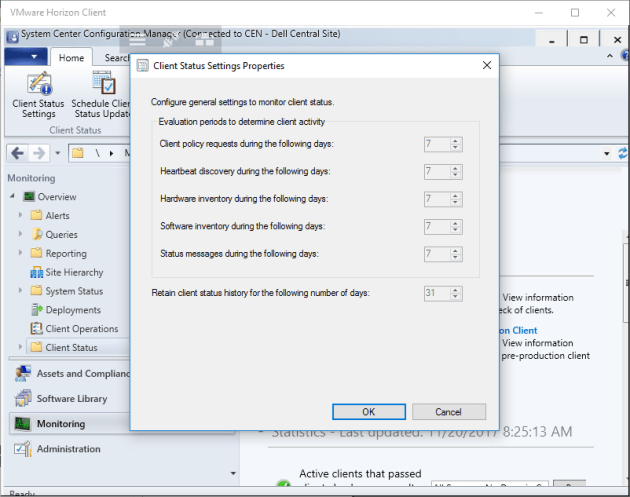
Prerequisite: You must have Client Heath options configured to retain the data for 30 days (or whatever number you require). In the admin console, go to Monitoring->Client Status, and select Client Status Settings. You can see for my environment, I’m retaining the information for 31 days.
Here is the SQL used for the reports – just update the SiteCode and desired CollectionID.
SELECT  [Date]
      ,[CollectionID]
      ,[SiteCode]
	  ,ROUND([ClientsActive] * 100.1 / [ClientsTotal], 1) AS PercentActive
	  ,[ClientsActive]
	  ,ROUND([ClientsHealthy] * 100.1 / [ClientsTotal], 1) AS PercentHealthy
	  ,[ClientsHealthy]
  FROM [v_CH_ClientSummaryHistory]
  where [Clientstotal] > 0 and datediff(day,[date],getdate()) < 30 and SiteCode='GMR'
and CollectionID='SMS00001'
  order by date
1. Using Report Builder, create a new report and connect to your ConfigMgr database. After you’ve verified connectivity, you’ll see the “Design an query” page. Select “Edit as Text”:
 2. Paste your query, and click the red exclamation mark to run it (always test it here, to ensure you receive the expected results):

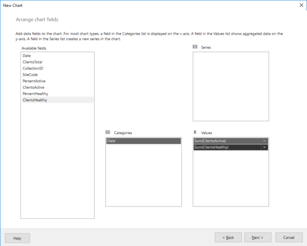
3. Click Next, and then chose “Line” for the chart type, and then Next again. Now you need to select the fields, as shown here:
4. Click Next again to see a preview (don’t pay much attention to the shape of the graph in the preview – it’s not using your values), and then Finish.
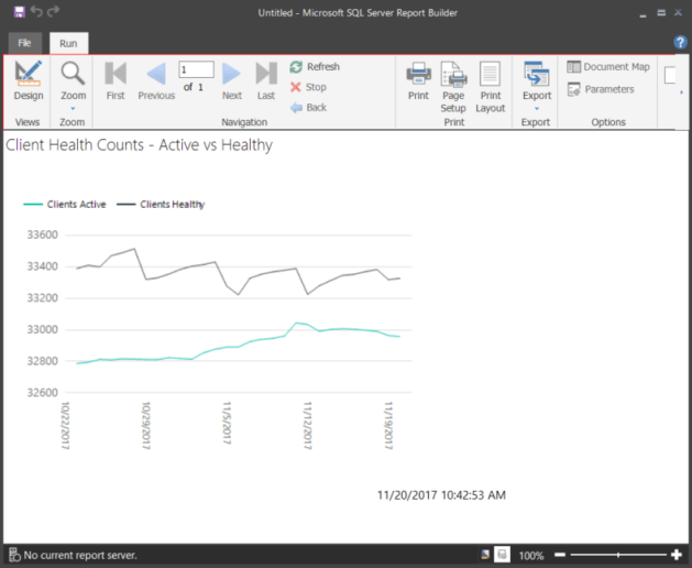
5. Now from this view, add a catchy title (“Client Health Counts – Active vs. Healthy”) and click the Run icon in the tool bar to view the data. Nice start, but still room for improvement.

6. Click Design to clean this up a little. Let’s modify the scale, so we can focus on what’s important. Single-click on the Y axis (you may need to click it a second time to get proper focus), and then right-click to select “Vertical Axis Properties.”

7. The easy button is to clear the Always include zero option and click OK:

8. Perform similar steps to get to “Horizontal Axis Properties” and change the Axis type to Scalar:

9. You now have a pretty nice graph to show you client health
Now that you’ve successfully created “Client Health Counts – Active vs. Healthy”, go back and create a similar report to show percentages instead of counts (Hint: The SQL query above contains all the info you need).
Stay Tuned! I’ll follow up this post with a couple more to cover gauges and spark lines!
Greg

Pingback: SSRS - Client Health Dashboard - sccmf12twice.com